

Colour sets the mood in a room before anyone speaks. A warm wash can make a church feel welcoming, a deep blue can quieten it for prayer, and a burst of bright colour can lift a celebration. Church lighting should help people focus on worship and the message, not on the lights. Colour helps with that: it sets the tone as people walk in, marks the transitions between worship, the sermon, prayer and response, reflects the church calendar so Advent, Christmas, Lent and Easter each feel different, and gives the platform depth so it doesn't look flat in the room or on camera.
This guide looks at the colours churches commonly use for different moments in a service and through the church year, and then turns to the practical side: how much saturation to use, how to keep faces looking natural, what the livestream camera needs and how to build simple presets your volunteers can run.
💡 A note on colour and emotion
The links below between colour and mood come from common practice in churches and theatres, and from cultural and liturgical tradition. They are not scientific rules. People respond to colour differently, and associations vary between cultures, denominations and congregations. Treat them as starting points and watch how your own room responds.
Colours and the moods they are commonly used for
Swatch colours are approximate and will look different on screens and on stage. Mix colours on your own fixtures and check them on camera.
⛪ Following the church calendar?
The seasonal colours above loosely follow the liturgical colours many Western churches use (purple or blue for Advent, white or gold for Christmas and Easter, purple for Lent, red for Pentecost, green for Ordinary Time). Traditions differ, so check with your pastor or worship leader before committing a season's look.
Many South African charismatic, Pentecostal and independent churches don't follow a liturgical calendar. For them these are design ideas, not rules.
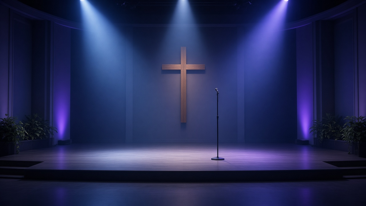
Choosing colours for each moment in the service
Walk-in and welcome
Go warm and inviting: soft amber or warm white on the platform, with a gentle accent colour on the back wall or architecture. Avoid dark, heavily saturated looks that can make the room feel closed off.
Praise and celebration
Upbeat songs can carry more colour and contrast: gold, magenta, red or mixed complementary colours (for example amber and blue). Movement and gentle colour changes can add energy, but keep changes in time with the music and avoid strobing or rapid flashing. Flashing light can affect people with photosensitive conditions and pulls focus from worship.
Reflective worship and prayer
Bring the overall level down and shift to deep blue, purple or very warm amber. Slow crossfades (5–10 seconds or longer) feel calmer than snaps. Keep enough light on the leader's face for them to be seen, and on the aisles for safety.
The sermon
Colour usually steps back here. Light the speaker in clean, neutral white so they read clearly in the room and on camera, and keep a subtle, low-saturation wash on the background for depth. A strong colour behind the preacher can compete with the message.
Communion
Many churches choose warm, intimate light: low-level amber or warm white, sometimes with a soft focus on the table. The aim is a quiet, reverent feel without making it hard to see the elements or move around.
Response, altar call and ministry time
Similar to prayer: a soft, unhurried look in blue, purple or warm tones, with the front of the platform lit well enough for people coming forward to move safely.
The church year: seasonal looks

Saturation vs subtle washes
The same colour can feel very different depending on how saturated it is.
🎯 Rule of thumb
saturated colour on the back and sides, cleaner and less saturated light toward the front. Most of the mood comes from the background; faces stay natural.
Older or historic buildings: stone, wood and stained glass often look best with warm, restrained colour that highlights the architecture rather than painting over it.
Keep faces in clean, neutral front light
🙂 Faces first
Whatever colour is on the back wall, the people leading should be lit from the front in white or neutral light.
- Saturated colour on faces looks unnatural in the room and worse on camera (skin can turn grey, green or blotchy).
- Use the same colour temperature for all front light (for example around 3200K for a warm look or 5600K for a cooler, camera-friendly look) so faces match across the platform.
- Front light at roughly 30–45° above the subject's eye line and from both sides reduces harsh shadows under the eyes.
- If you only have RGB fixtures for front light, mix a soft white rather than using pure colour, and check how it looks on skin. Fixtures with a dedicated white emitter (RGBW, RGBA or white-plus-colour) usually give better skin tones.
Camera and livestream caveats
Cameras do not see colour the way people do. A look that works in the room can fall apart on the stream.
🎥 Livestream checklist
- Saturated blue and red can clip on many cameras, losing detail and looking blocky or noisy. Pull saturation back a little if it looks harsh in the monitor.
- Lock the camera's white balance to your front light rather than using auto, which can shift when the background colour changes.
- Keep faces brighter than the background. Cameras expose for the overall picture, and a bright coloured wall can leave faces dark.
- Watch for flicker. Most LED fixtures dim by switching the LEDs on and off rapidly (PWM). If the PWM rate is low compared with the camera's shutter speed, rolling-shutter cameras show crawling dark bands, worst at low dimmer levels. Fixes: set the fixture's PWM or refresh rate higher if its menu allows, keep the shutter at about 1/50 s for 25 fps streams, use ND or iris rather than shutter for brightness, and test at your stream's frame rate before Sunday.
- Always check the stream monitor, not just the room, when building looks.
Simple DMX presets and scenes for volunteers
Many church lighting teams are volunteers who run the desk once or twice a month. A small set of well-named, pre-built scenes makes Sunday much less stressful.
A starter set of scenes
🎛️ Tips for volunteer-friendly presets
- Name scenes by service moment, not by colour ("Sermon", not "Blue 3").
- Build in fade times so a single button press gives a smooth change.
- Keep front light consistent across scenes and change only the background, so faces never vanish by mistake.
- Keep a seasonal palette (Advent, Christmas, Lent, Easter) as separate pages or banks, so the weekly scenes stay the same and only the colours change.
- Write a one-page cue sheet with the order of service and which scene goes where.
- Lock or protect the master scenes on the desk so they aren't overwritten by accident.
Quick checklist before Sunday
✓ Faces in clean, neutral front light in every scene.
✓ Background colour supports the moment rather than competing with it.
✓ Saturation checked on the livestream monitor.
✓ No fast flashing or strobing.
✓ Aisles and steps lit for safety during low-light moments.
✓ Scenes named clearly and a cue sheet left at the desk.
Want your team to feel confident on the desk?
If your volunteers would like hands-on help building looks and presets like these, Lampie offers practical lighting training. Get in touch to find out more.